Even with the most engaging subject matter, it is difficult to capture and hold an audience’s attention. So, how can you construct your presentation to effectively support your message, while also educating and engaging your audience?
1. Shorter Presentations
In today’s environment, information is easily accessible, therefore you rarely have much time to make your point. Whether you’re giving an informational or sales presentation, an outline can help you set expectations and build anticipation. Include a clear agenda at the beginning of your presentation so that your audience knows when to expect questions, what subjects will be covered, and how long the session will run. This not only engages your readers, but also serves as a handy roadmap. As a first tip, determine your presentation’s framework early on.
Use bullet lists and succinct wording to highlight essential topics throughout the presentation. Finish with a final slide that summarises the most crucial.
Design Tips
- If your ppt content takes more than a few seconds to read, it’s preferable to delete it. Your audience is reading but not paying attention to your words.
- Use AI tools such as SlideSpeak.co or Microsoft Copilot to help you summarize the text efficiently.
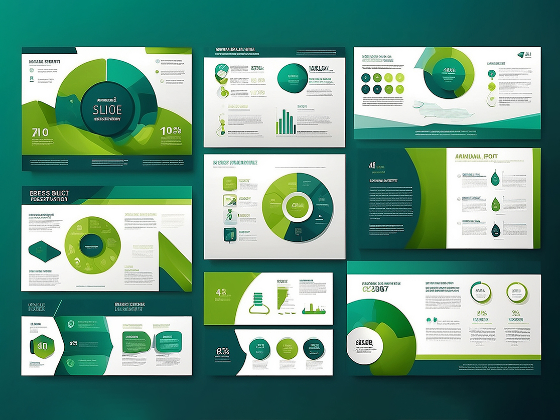
- Instead of long text, use diagrams, charts, or graphs to visually summarize data and key points.
- Use bold or larger font sizes to emphasize the most important points. Make sure the audience knows these are the key takeaways.
2. Visual Hierarchy
Visual hierarchy is an important design principle that you encounter on a regular basis, even if you don’t realise it. Simply described, it is the ordering of design elements in order of priority using a variety of graphic design strategies. For example, titles are usually larger and bolder than subtitles, focussing the viewer’s attention to the main message first, followed by supporting elements. This strategy ensures that the most significant information is prioritised and processed first, followed by secondary stuff. Using visual hierarchy successfully is critical for delivering your idea clearly, regardless of media.
So, why is this important in presentation design? When used correctly, a strong visual hierarchy allows your audience to better understand your essential arguments. Whether you’re delivering a training session or pitching to a potential client, this is critical. To incorporate visual hierarchy into your designs, focus on elements like color, size, font, and placement. Highlight important information by using contrasting colors to make it stand out from the rest of the content. When it comes to web design, calls to action (CTAs) are often emphasized with bold or bright colors to guide the user toward the next step. In presentations, apply this principle by making the most actionable information easy to identify and remember.
Design Tips
- Ensure your titles clearly summarize the slide’s purpose and use different fonts or font weights for titles versus body text. For a more dynamic look, consider using a complementary font or a heavier weight for titles.
- Don’t overcrowd your slides. Whitespace gives the eye room to focus on key elements without distraction, helping the audience process information more clearly.
- When using diagrams or charts, ensure key data points or conclusions are the most visually prominent—whether through size, color, or placement.
- Place your most important information in the top-left corner or center, where it’s naturally read first. This is particularly useful for titles and key concepts.
3. Layout
It’s important to consider the space that’s allotted to each design element on your slide. The same principle applies to positioning: make sure each element has enough space to breathe. For items that need to draw attention from the back of the room, use large fonts, contrasting colors, and appropriate sizes to make them stand out. Avoid using colors that are too bright for small text, as they may be difficult to read from a distance. A useful presentation making strategy is vary the layout of different slides instead of using the same structure for all slides. Varying the layout will keep your audience interested and prevent your slides from looking monotonous.
Design Tips
- The Rule of Thirds is a classic design principle where you divide the slide into three horizontal and three vertical sections. Place key elements along these lines or at their intersections to create more dynamic and engaging layouts.
- PowerPoint’s grid and guides are helpful tools for creating a structured, organized layout. These can help you position text, images, and charts with precision, maintaining uniformity across slides.
- Use contrast to highlight key points or sections of the slide. Contrast between light and dark elements, or large and small fonts, helps differentiate the most important information.
4. Creative Copy
We’ve all experienced a dull corporate meeting room, but there’s nothing worse than seeing an audience disengaged and yawning in between a presentation. To prevent this, try bringing more creativity to your copy. Storytelling is a powerful tool to captivate your audience, and you can enhance it visually as well. Pairing relevant imagery with your text and using icons to highlight key points not only makes your presentation more engaging but also helps the audience better grasp and retain the information you’re sharing.
Incorporating open-ended questions (those that can’t be answered with a simple “yes” or “no”) can spark discussions and encourage interaction. Combine this with effective visual hierarchy and you can craft copy that prompts participation or invites deeper reflection.
When adding copy to your slides, remember that visual elements should generally outnumber the text. Graphics are easier to see and more impactful, especially from a distance, and they help reinforce your key messages. Keep your copy brief and to the point, using your slides as a visual summary rather than a script to read from.
Design Tips
- Start sentences with action verbs to make your copy more dynamic and engaging. For example, instead of “The project will be successful,” use “Achieve success by…” This motivates your audience and encourages them to act or think.
- When appropriate, add interactive elements such as polls, surveys, or discussion prompts.
5. Avoid Overusing Numbers
Just like with text, it’s important to limit the number of numbers on each slide. If you have charts that summarize the key figures at the end, avoid cluttering them with detailed numbers on the scale. Instead, focus on presenting the overall insights for clarity and impact.
Design Tips
- Don’t display small-scale numbers on every chart element. If a chart is intended to show a trend or overall pattern, focus on presenting the main takeaway and leave out the detailed scale.
- Consider using infographics to represent data visually instead of relying solely on raw numbers. Visual elements such as icons, progress bars, and pie charts can make information more digestible.
Conclusion
In conclusion, designing an effective PowerPoint presentation requires careful attention to several key elements: brevity, visual hierarchy, layout, creative copy, and smart use of numbers. Whether you’re delivering a pitch, training session, or informational presentation, these design principles will help you communicate your ideas clearly and effectively, leaving a lasting impression on your audience.